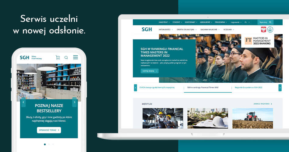
Clear, legible, intuitive – can university’s website, filled with information, references and important documents, works this way? Our team created the new version of the Warsaw School of Economics (Polish: Szkoła Główna Handlowa – SGH) website and proved it is possible. But all begins from the solid foundation. In this case, it was research.
Challenge
Our task was to design the main SGH website with its all subpages. The whole project was created based on the UX research of the website layout during workshops with potential users. Afterwards, we prepared an appropriate report – concerning both the target group itself (opinions and points of view for the new solutions) and the usability review of the website.
Our approach
We started with research plan and then the research itself. We asked potential users about their needs and first impressions of the new layout, whether it is easy to use and intuitive for individual groups.
Based on the results, we worked through the style guides, components and the entire visuals so that it was functional for each of the four groups of users highlighted in the process. Website that we created is simple, intuitive and functional as well as consistent at every level. Apart from the main website, where you can find lots of materials and information necessary for individual groups of users, we have also designed online store where the they can buy books or university related gadgets.


