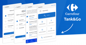
Refuelling… seems like a simple activity that no one thinks about. But could it be even simpler and more convenient? Yes! With the new module of the My Carrefour application – Tank&Go. You can refuel your car without standing in line and without taking out your wallet. Everything at your fingertips – with your smartphone.
Challenge
Our work began with an analysis of business needs and technological capabilities. Then we conducted workshops with the client. On their basis, we created user flow and functional mock-ups that helped to refine the process and information architecture.
In order to respond to the design needs, we had to take into account very specific and special circumstances of using the Tank&Go module. Users will be using it primarily while refueling – standing with their phone in their hand. Therefore, the designed user path consists of very simple screens. Each of them requires the user to make only one decision and pay attention to one issue.
During the process, the user can select in turn:
- one of the many profiles created (private or company),
- the refuelled car (which of the previously added cars will be refuelled),
- refueling amount,
- payment card from Masterpass wallet.
The application, using the GPS location, checks on its own which station the user is at. The user is only asked to specify the number of the fuel distributor – he can enter it himself or conveniently scan the QR code located on the distributor.
During the design process we also paid attention to the fact that the application clearly indicates when refuelling can begin. This information was clear enough for a first time user to have no problems with it. After refueling is complete, the user receives a summary of the transaction.
During the development we also made sure that the use of Masterpass account (which is an external tool) was as smooth as possible – this mainly concerns registration in the Tank&Go module and payments during refueling.
In the next stage, on the basis of functional mock-ups, we created projects of graphic interface. It was designed in a minimalistic style – transparent and consistent with the rest of the My Carrefour application.
After implementing the designed Tank&Go module, we conducted usability tests. Their goal was to refine the operation of the application, and above all, the user path and push notifications. As for the latter, after minimizing the application or locking the phone screen, they inform the user about the stages of the refueling process.
At the final stage of the project there were further tests – quite unusual, because conducted at a gas station, using a real distributor. This allowed us to check in real conditions the most likely scenarios for the behavior of the user using the Tank&Go module, and to test the application communicating in real time with the distributor.


