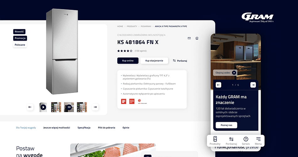
GRAM is a brand that has been operating on the scandinavian market for 120 years. It has extensive experience and knowledge on how to help its customers refrigerate, freeze, cook and bake. It offers precisely designed devices that are distinguished by their design, durability and functionality. Our task was to design the Polish GRAM website, presenting the entire product portfolio of the brand.
The biggest challenge when designing the GRAM website was to translate to Polish realities what the brand has offered so far to its Danish customers. Therefore both the communication and the visual layer required an appropriate approach. Although we had basic content, we created all communication from scratch, a story about a premium brand launching on the Polish market.
Our approach
We designed functional mock-ups based on UX and UI experience and created a brandbook for the purpose of entering the Polish market. As a result, a simple, functional and transparent service was created to communicate completely new brand on the Polish market, offering high-quality household appliances.
Our task was to create both the main page, as well as listing page, product cards, about us tab or the main product LP. The products have been divided into categories and presented in a thoughtful way. On one hand, to find the most important information is simple, and on the other – it’s visually attractive to a potential customer.
As a result, we have created a narratively and visually coherent story about the brand, which is distinguished by its scandinavian design, functionality and technology. It’s a brand for which „Every GRAM matters.”


