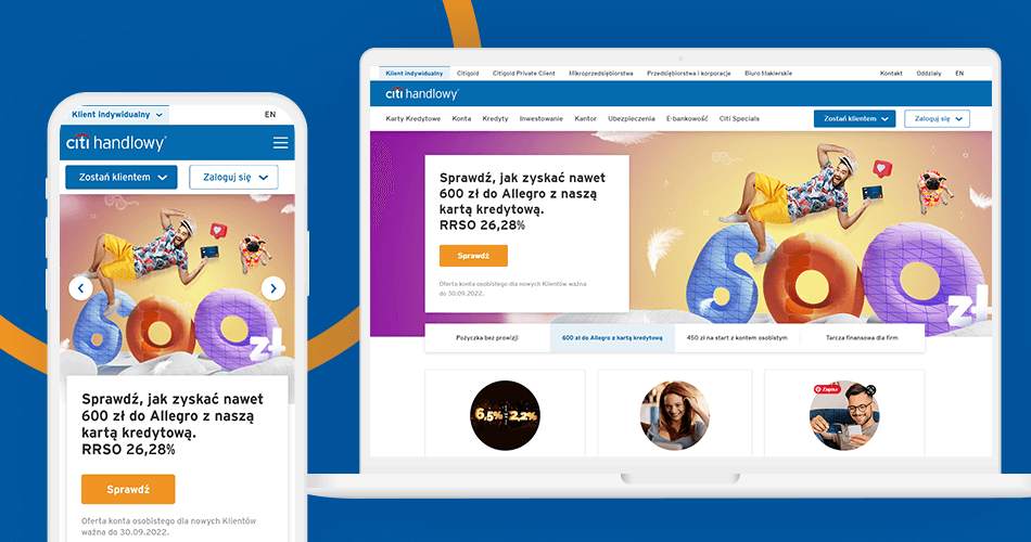
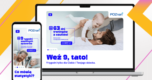
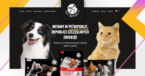
The Citibank homepage, as well as some of its subpages has gained a new look. And all this thanks to the work of our golden UX and UI teams. Website refreshment was an important step on the road to better communication with the customer. We are delighted to have been such an important part of this process.
Challenge
Our goal was to refresh and unification the Citibank home page and some of its subpages so it would gain a more modern feel. The whole project was designed taking into consideration the graphical styles already developed by GoldenSubmarine, along with the client’s existing branding.
Our approach
We have diversified the layout of the homepage to present content more attractively and encourage users to explore. The project has gained a consistent, light, simple and non-overwhelming look. In addition, we have rebuilt the website to show more clearly the most important paths of exploring Citibank’s offer. The project also includes space for additional action banners and smaller sections for dedicated pieces of information
On the main page, the user will find links to the most important and most frequently searched information/subpages and the loan calculator, which for many users is the starting point of navigation of the bank’s offer.
In addition, we have also refreshed the look of the footer and menu, giving them a modern and minimalistic style. All was optimized for both desktop and mobile.
The modules proposed by us work in such a way that they can be used in the future in an unlimited way. Thanks to this, building subsequent subpages will allow maintaining stylistic consistency.
The new website has gained in functionality, legibility and modernity. Organizing the information architecture has also accelerated the way users reach what they are looking for on our website.


