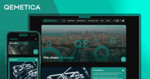
The rebranding of the CIECH Group into Qemetica was a move that brought the company fresh energy and a modern image. At the heart of this process were our agencies, GoldenSubmarine and GoldenGrid, which took on the challenge of creating a completely new corporate website. We would like to take you behind the scenes of this fascinating process — one that led to the creation of a portal reflecting both the brand’s values and the needs of its users.


What is Qemetica?
Qemetica is the former CIECH Group – a leading chemical company operating on the European market and supplying key products to industries such as manufacturing, construction and agriculture around the world. The company invests in innovation while staying committed to sustainable development. Qemetica is actively implementing its ESG strategy, aiming to achieve climate neutrality by 2040.
Our goal was to create a website that not only looks attractive, but above all works exceptionally well. The new site was designed to become Qemetica’s digital showcase, combining modern design, intuitive navigation and clear communication of the brand’s values.
Discovery workshops: a deep dive into real needs
The key to success lay in the discovery workshops – a series of inspiring meetings that helped us understand what truly matters to users and what business goals the new portal should support.
Workshop objectives:
- Gaining knowledge and understanding of user needs – It was essential to understand which functionalities and information were most important for the users of the new website.
- Defining business goals and project context – The new website needed not only to look modern, but also to support the company’s strategic business objectives.
- Identifying the key elements of the project – Through close collaboration with product and project teams, we identified the most important components that had to be included in the new website.
- Identifying problems to solve and setting project priorities – The workshops helped uncover potential challenges and define the most important tasks, enabling more effective planning of the next stages of work.
What did we discover during the discovery phase?
Workshops are our secret weapon. They took place in several stages and included interviews, brainstorming sessions and analysis of data from the existing website. It was a true brainstorm — and it sparked plenty of valuable insights. Thanks to them, we identified the key areas that needed improvement and attention right from the start:
- Simplifying structure and navigation:
The existing website resembled a maze of information, which could easily discourage users. What we needed was simplicity and clarity.
- Presenting products clearly and attractively:
The previous way of presenting the product offering was, to put it simply, tangled up. We focused on clarity and visual appeal so that users could easily find what they were looking for.
- Improving news communication:
The news section was scattered like puzzle pieces. Our goal was to bring everything together in one place and create a clear, easy-to-browse system.
- Working on responsiveness and accessibility:
The website needed to work perfectly on every device and be accessible to all users, regardless of their abilities. We focused on full responsiveness and core accessibility standards.
Execution
The data gathered during the workshops allowed us to create an advanced UX wireframe that addressed the needs of all target groups. We then moved on to designing the layout, combining modern aesthetics with functionality.
Key features of the new website
- Intuitive navigation – The new website structure makes it easy to find information thanks to a clear menu and a logical page layout.
- Interactive elements – We introduced interactive sections that engage users and make the website easier to use.
- Responsiveness – The website is fully responsive, ensuring an excellent user experience on every device.
- Accessibility – The website is available in three language versions: Polish, English and Romanian, making communication with international clients easier.
- News and blog – The news and blog section allows content to be updated regularly, increasing user engagement.
- Sustainable development goals – On the homepage, users can learn about the brand’s sustainable development goals, embedded in its business strategy.
CMS implementation
We also decided to implement a proprietary CMS solution, which became the foundation of the new portal. It allowed us to create the website in three language versions: Polish, English and Romanian, with more versions already planned.
“Thanks to the fact that, as a result of an extensive workshop process, we prepared such a universal and comprehensive visual design system, we were able to adapt it quickly and easily to the needs of other companies within the group”
– said Karolina Gruca, Group Account Manager at GoldenSubmarine.
Conclusions and recommendations
The process of rebranding and creating the new Qemetica portal was a journey of growth — one that showed just how crucial in-depth analysis and a solid understanding of user needs and business goals really are. The discovery workshops proved to be an invaluable tool, allowing us to create a website that is modern, functional and tailored to user expectations.
The new corporate portal of the Qemetica Group is now live, and it has also served as the foundation for the QemeticaSol website, dedicated to the group’s salt business. This proves that a thoughtful and well-executed UX process can take a company to the next level.
We invite you to work with us and discover how thoughtful design can transform your business.