At the heart of modern civilisation, at a time when technology seems to shape our everyday lives more and more, national parks remain priceless sanctuaries of nature. These secluded enclaves of wilderness protect unique ecosystems and species — but they also serve us, offering spaces where we can find peace, feel inspired and reconnect with the natural world.
That’s why we were delighted that, this time, our technology could support people’s experience of nature — even just a little. We set out with great enthusiasm to take on a task entrusted to us by the Ministry of Climate and Environment: the comprehensive redesign of 23 websites for Polish National Parks.


The start of the adventure
We took on the challenge of designing a website that would refresh the park’s image while raising usability standards. These were the project goals that set our direction:
- Visual modernisation and navigation optimisation: The priority was to design a modern interface that would not only be visually appealing, but also make navigation easier, allowing users to reach the information they were looking for quickly and efficiently.
- Expanding the information architecture: Our strategic goal was to reorganise and expand the information structure in order to make key data easier to access, improving the overall usability of the website. We focused on ensuring that every element of the site was logically structured, making essential information intuitive to find.
Mapping the terrain – Phase I: Discovery
The first step was to understand why the old website was no longer doing its job. We carried out an in-depth UX audit, which revealed the main pain points: overly complicated information architecture, outdated design and unintuitive navigation. Users needed easy access to information about trails, weather conditions and the park’s main attractions — all of which were essential for their safety and comfort.
Understanding the space and its users
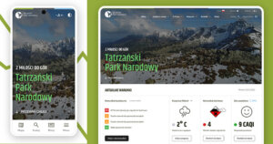
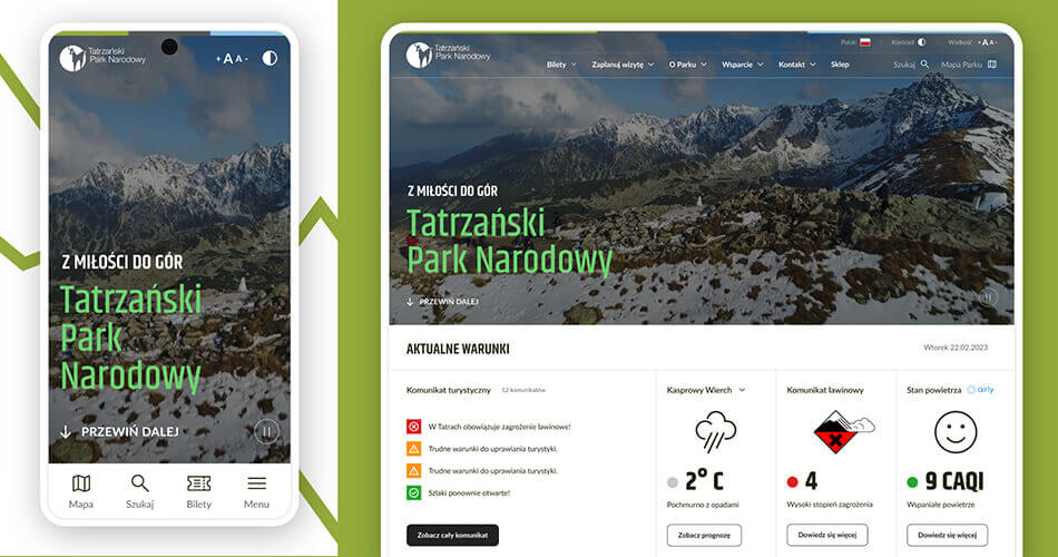
To meet the expectations of the website’s future users, we began by gaining a deep understanding of the specific character of Tatra National Park. It is one of the best-known and most frequently visited places in Poland, attracting millions of tourists each year who come to admire its natural beauty and enjoy the many opportunities for active leisure.
At the outset, it was essential to conduct detailed research and analysis to help us better understand how users interacted with the website, as well as what they expected and needed from it. Our research focused on adapting the information architecture so that visitors could move around the site easily and intuitively, quickly finding the information they needed — such as trail descriptions, weather conditions or park regulations. We wanted to make sure the new website would meet the needs of both experienced climbers and families with children looking for a calm escape into nature.
Charting a new route
Co-creation workshops proved invaluable. Together with representatives of the Ministry of Climate and Environment, Tatra National Park and other Polish national parks, we mapped out new paths for the website’s development. These interactive sessions gave us a deeper understanding of what users wanted to find on the site and how best to present it.
This stage of the project ended with exploratory research involving recruited users. Exploratory research allows us to uncover and understand the needs of current or potential users — including those we may not have been aware of before.
A tree on the trail
One of the key elements of the process was the use of Tree Testing. This research method makes it possible to evaluate information structure, which is particularly important for websites that need to manage a rich and extensive body of content.
Study participants are asked to locate information within a diagram stripped of the website’s visual layer, relying solely on its text-based structure. This allows us to assess whether the arrangement of categories and subcategories is logical, and whether individual elements are easy to find.
Tree Testing was carried out before the final website design was introduced, helping us minimise the risk of navigation issues and ensure that the information architecture was clear and intuitive for users.
Designing the paths – Phase II: From UX to UI
Designing the website’s UX and UI was much like planning mountain trails — we had to anticipate every possible user scenario. Creating coherent and intuitive navigation was crucial, especially given the wide variety of content and activities offered by the park.
Thanks to RITE testing — Rapid Iterative Testing and Evaluation — we were able to test different versions of the website with real users, which allowed us to introduce changes quickly and adapt to evolving needs. This method enabled us to refine the project on an ongoing basis, maximising user satisfaction.
Creating a coherent and visually engaging space
The visual side of the website was just as important. We wanted the design to reflect the park’s natural beauty while remaining modern and engaging. The use of high-quality photography and video, together with a consistent colour palette, was intended not only to capture users’ attention, but also to inspire them to visit the park.
We created a design system which, together with the full website concept, was then applied to the designs of the remaining 22 national park websites.
Technology in the service of users
During the UX and UI design phase, we also focused on the website’s technical aspects, including responsiveness. Accessibility was another key consideration: we made sure the site included a clearly visible menu for choosing the language, changing contrast and adjusting font size.
Implementation and consulting – Phase III: Launch
The final stage was not only the technical implementation of our design, but also an ongoing advisory role. We supported both the development team and the client across a wide range of questions and concerns.
The result? A website that not only presents Tatra National Park beautifully, but also guides users effortlessly through the resources and information that matter most to them.
Reaching the summit
The entire design process, which lasted many months, was more than just another project for us — it was a true adventure. We had the chance to see in practice how important it is to involve users early in the design process, and how crucial continuous iteration and adaptation to changing conditions can be — just like on a mountain expedition.
By designing the website for Tatra National Park, we not only renewed the digital presence of one of Poland’s most beautiful places, but also blazed the trail for future projects. We’re happy to have been part of this journey!
The full Polish National Parks website can be found at https://ppn.gov.pl.
The Polish National Parks website was created as part of Project POIS.02.04.00.00-0001/15, “Promotion of National Parks as a Brand”, co-financed by the European Union under the Infrastructure and Environment Operational Programme 2014–2020.